The font choice in Twenty Fifteen is an interesting one.
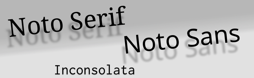
By default Noto Serif is used for the major part – that is the entry body text, headings and the post titles in the sidebar –, Noto Sans is used for headings in the side bar and elsewhere. The fixed-width font is Inconsolata.
Google’s Noto font is very young (released 2013), and they say this font has an ambitious goal:
Noto is Google’s font family that aims to support all the world’s languages. Its design goal is to achieve visual harmonization across languages. Google
The first statement surely is something good. But I don’t really understand the second one: Visual harmonization across languages
, what should this be good for? Is this desirable? Maybe, yes, for some multilingual legal papers.
But in general I’d rather prefer texts in different languages also being characterized by distinct (non-harmonized) representations. When I’m in the mood for visual harmonization across languages
I usually visit Wikipedia…
Noto vs Open Sans
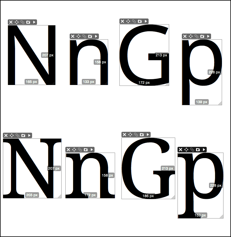
Noto is apparently an Open Sans clone, glyphs and metrics are virtually identical. The differences are:
- Font weights Noto has only the two standard font weights, Normal (400) and Bold (700). Open Sans provides additionally Light (300), Semi-Bold (600) and Extra-Bold (800).
- Glyph set Open Sans has a very limited glyph set (938 glyphs currently), Noto has an extended set of about 2400 glyphs.
- Styles Open Sans exists only as, well, Sans. Noto has a serif variant.
Concerning the glyph range in the symbol, letter-like and punctuation department, Noto is to Open Sans what DejaVu is to Vera Bitstream. Of course, DejaVu – being developed for 10 years – does a better job here, its glyph set is really comprehensive. While Noto’s set is clearly better than the rudimentary set of Open Sans it still leaves much to be desired (despite its name!).
Speaking about DejaVu, one thing I don’t like about DejaVu Sans is the missing Italic (it only has an Oblique). Noto Sans (and Open Sans) has an Italic.
Serif or Sans?
By using a serif font for the text body the theme is ignoring the long-time doctrine “Serif for print and Sans for the screen (web)”. While I still agree with this when it comes to my low-resolution desktop screen, I often catch myself preferring a serif font on the higher-resolution iPad display.
That being said, the Noto Serif font has a problem: apparently they tried to make the Serif metrics-compatible (or at least “metrics-similar”) with the Sans variant. And indeed, metric-wise the two variants are pretty close.
The good thing is that you can switch between the fonts without the need for dramatic size or layout adjustments. The ugly thing is that Noto’s Serif isn’t really a Serif with an “character” of its own, it’s rather just a serifed Sans font. One result of this is that the Serif variant looks very compressed. Probably the Serif was an afterthought, and for me somehow it’s not a “real” Serif font.1
I’m still undecided if I should go with a Serif or a Sans for the text body, but if I stay with a Serif, there are nicer things than Noto Serif. For example the already mentioned DejaVu Serif, or, another Serif font that looks surprisingly good with the theme, is Lucida Bright.
If I go Sans I’d prefer also DejaVu, just because I like it’s comprehensive glyph set with nice arrows, technical signs and extended punctuation. If this doesn’t matter for you, Noto Sans (or Open Sans) is surely nice.
Getting rid of Google
Twenty Fifteen pulls its fonts from Google Fonts. This is helpful for a quick first setup, but exchanging data with Google every time when the site is called is surely not tolerable. I already try to avoid the Google crap whenever possible, I don’t use Google Analytics either, so the last thing I want, is to transmit my – or my visitor’s – data to Google through the font API.
Fortunately there is an easy way to get rid of that without dismissing the luxury of custom fonts:
@font-face with Font Squirrel
Font Squirrel is a service that helps you to build your web fonts in the necessary formats and it also generates the accompanying @font-face CSS. Basically it’s a very simple process:
- Decide for a font (it should be open source / free / libre).
- Upload the font files to Font Squirrel and get the web font kit in return.
- Upload the web fonts to your site and set the font link in the header.
More verbose:
Choose your font If you go the Font Squirrel way you should choose a free font. Firstly it would be illegal to use a font that, for example, comes licensed with your operating system. Secondly, Font Squirrel will likely refuse to convert proprietary fonts.
Tip I: While Font Squirrel offers to download pre-made webfont kits you should do this only when you are in a hurry.
Tip II: Font Squirrel also offers many free fonts for download but I noticed that these are often not the current versions. So in general it’s better to download the font directly from the font’s homepage.
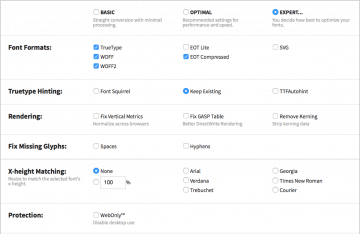
Upload and Settings In Font Squirrel go to the Webfont Generator tab. Upload your fonts (max. 4) and select the Expert option. This allows you to get just what you need and thus really minimizing the font data size. For the settings I recommend the following:
- Font Formats: You can uncheck SVG. Contrary to what Font Squirrel says it is not needed for iOS (only for iOS version up to 4.1; but is anybody still using this?)
- TrueType Hinting: Keep Existing.
- Rendering: Deselect all.
- Fix Missing Glyphs: Deselect all.
- X-height Matching: Normally you’d leave this at None.
- Protection: Don’t know, I always leave it unchecked.
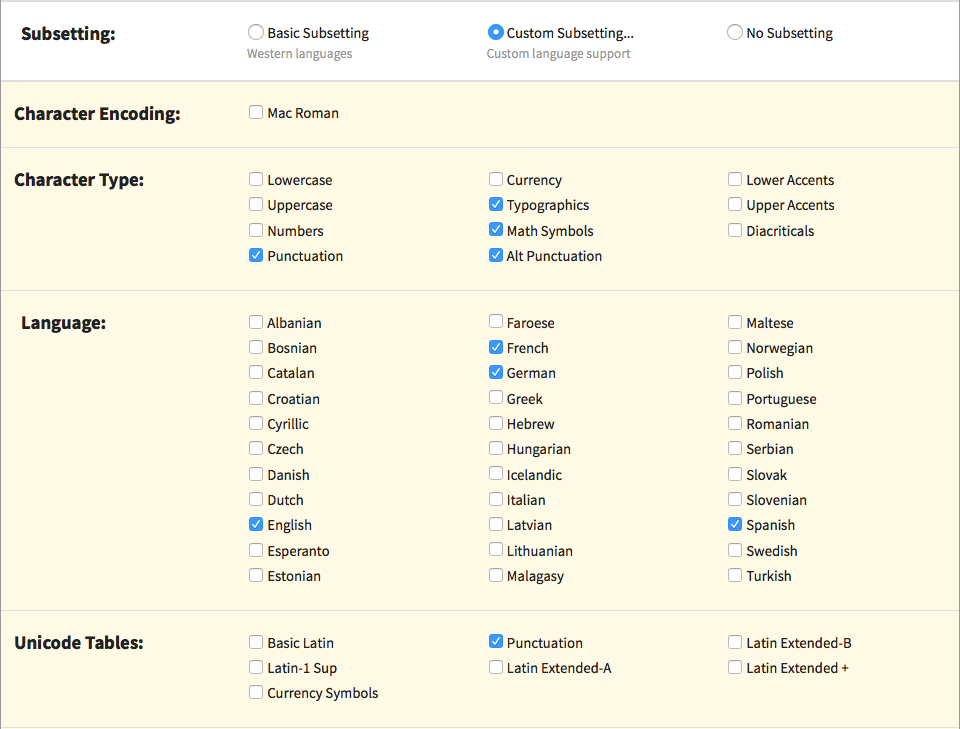
- Subsetting: This is important: It’s here where you can minimize the size of your web font package. Activate Custom Subsetting… and Select only the language(s) you need and try the other additional sets. The glyphs contained in each set are displayed in real time, so you see immediately if you need a certain subset.
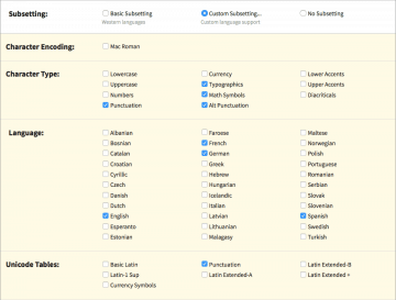
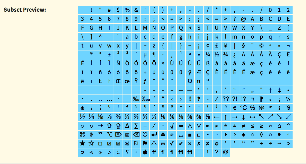
Font Squirrel: Subsetting example You can even further minimize your package by ignoring the preconfigured sets all together and just paste your hand-selected glyphs into the Single Characters field. (Of course, which glyphs will be included at the end depends on which glyphs are actually available in your uploaded font.) This is my favorite feature!

Font Squirrel: Single Characters - OpenType Features: As far as I know these are not supported by any browser.(?)
- OpenType Flattening: I didn’t test this and leave it unchecked.
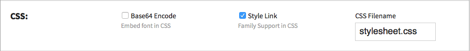
- CSS: Important: Select Style Link
- Shortcuts: Check to make it remember your settings.
Font Squirrel: Format Settings 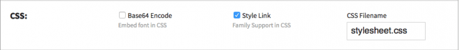
Font Squirrel: CSS Settings Check the Agreement box and start the download. This may take a minute or two, depending on the size of the uploaded font files.
Unzip the downloaded package. If you want, open the included demo html file to see the actually included glyphs in your web font.
Delete the demo files and the specimen_files folder, rename the whole web font kit folder to something meaningful (e.g. the font name) and upload it to your site.2
Set the link to the CSS in the header.php file like this:
<link rel="stylesheet" href="/[path to my web font folder]/stylesheet.css" type="text/css" charset="utf-8" />That’s all. Now you can call the font in your style.css for example with…
.entry-content {
    font-family: [my web font], Geneva, Verdana, sans-serif;
}
The [my web font] must correspond to the font name as in the stylesheet.css in your web font’s folder (for example
'dejavu_sans').3


Finally don’t forget to actually cancel all calls to Google Fonts:
You can either deactivate them by hand (look for twentyfifteen_fonts_url in the functions.php file in the theme folder) or use one of the available mini plugins, for example another-disable-google-fonts-plugin. This one works with the WP default themes up to Twenty Fifteen and it also disables the very superfluous Google Font calls for the admin interface font.4
Sources, Credits, More Info
Footnotes
- For comparison, DejaVu Sans and DejaVu Serif are really distinctive variants, each with its own metrics, but still recognizable as related fonts.
- The exact path is irrelevant, but if you plan to upload more fonts it’s probably a good idea to create a parent Fonts folder, for example at the root of your WP folder.
- It can’t hurt to check if the font weights and styles are set correctly in the CSS. Sometimes, especially with fonts that have more than the two standard weights, Font Squirrel gets confused.
- Yes, you have read correctly, WordPress pulls the Open Sans font – that by default is uniquely used for the admin interface – from Google’s server. How crappy is this!?